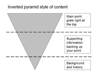
The ‘inverted pyramid style’ of writing and structuring information pages for the web, where the first paragraph summarises the key point of the whole page, is tightly aligned with how users scan and gather information from the web.
In a previous post ‘What are navigation pages / pathway pages' I looked at rules of thumb for navigation pages, how to get users to the detailed information quickly. Now your users have got to the information pages we’ll talk about what to put in them and how to structure them – the ‘inverted pyramid style’, this is relevant for both blog pages and deep content in a site.
What are the user goals on information pages?
- Scan to check that they got where they thought they were going
- Scan to see if what they are looking for is on the page
- Scan to find the key point of the page
- Possibly read more details to get background information
User research clearly shows users look at the page title, the headings and scan for key words in the text – primarily the first paragraph and then decide if they are going to read the whole page or note.
So how do I write information pages in the ‘inverted pyramid style’
- Put the key message / main point first – users tend to be selective (and lazy) they will read a few words or a paragraph before deciding if the information is relevant.
- Sum up the point of the page in a single summary paragraph at the top of the page
- Then add supporting information, which is ordered relevant to users
- Finally add history, background, additional links to find our more detail and detailed documents
Why a pyramid?
The pyramid represents the number of users who'll read the different layers of the page, only a few get to the end - that's why it's so important to summarise the key point in the top paragraph of your page.

Who supports the inverted pyramid style?
Web usability gurus such as Jakob Nielson: http://www.useit.com/alertbox/9606.html

