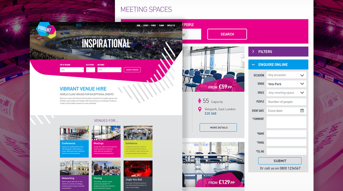
Following the success of previous projects with Lee Valley, including the Olympic White Water Centre and Lee Valley Farms websites, S8080 was approached to work on a project to promote the meeting spaces within their diverse and unusual venues.
With meeting space hire extremely competitive in the London area, Lee Valley needed a site that would showcase their iconic venues such as the VeloPark or the White Water rafting centre as interesting options for any occasion. The site also needed to align with its parent Vibrant Partnership website, whilst containing bespoke functionality that would allow users to find their perfect venue for a variety of event types.
After an initial alignment meeting to discuss their requirements, S8080 created a number of personas to identify the user needs. During further discussions, a structure for the information architecture (IA) was agreed that would accommodate the key user journeys. S8080 then produced detailed technical wireframes and hi-fi prototypes before beginning the visual design stage.
User journeys could involve anything from a corporate booking for a conference or product launch with hundreds of people attending, right through to a family party. The major challenge was to accommodate everyone, from visitors who knew the exact requirements of their event through to those who may have a specific venue or type of event in mind.
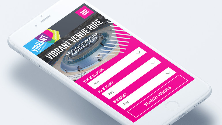
Based on these varied user journeys, the ability to search the available meeting spaces needed to be core functionality on the site. Users needed to search spaces based on the number of guests, type of occasion, venue and location. They also needed to be able to browse venues and meeting spaces suitable if they were looking for ideas for a specific occasion.

Bespoke templates containing a variety of content types needed to be developed. So users could experience a true sense of the venue, whilst providing all of the necessary information required for event organisers, the templates accommodate everything from image galleries and YouTube 360 video through to document uploads for floorplans and health and safety information.
We needed to make it quick and easy for users to make an enquiry. A sticky contact form based on the user browser position made it simple for users to engage with the site and allowing to the venue to follow up with a phone call.
The site was built to work on the client’s existing Umbraco CMS (content management system) platform alongside their other suite of sites. The major technical challenge was to structure the data in such a way so the site could be easily managed by the client. The synergy between the venue site and its parent Vibrant Partnerships site provided a consistent user experience.
The combination of inspiring imagery and a clear and consistent user experience creates a website that really puts these iconic venues on the map as superb locations for any occasion.

